
BLINDSPOT THESIS / NO. 001
A live product deserves
a live first impression.
Vano connects opportunity discovery, market analysis and an assistant. The landing page can do more to let visitors see, understand and try that workflow before committing.

Product Engineer & Strategist · Founder, BlindspotLab
working.
LET THE FIRST IMPRESSION CATCH UP.
THE BLINDSPOT
The product explains itself.
Now let people experience it.
Vano has a coherent story: find an opportunity, understand its structure, ask better questions and keep watch. The opportunity is to shorten the distance between that promise and evidence a visitor can evaluate.
Keep the calm visual identity and the emphasis on context and invalidation. Make the proof more concrete, the entry points clearer and the first interaction easier to reach.
A DIRECTION YOU CAN SEE
Before. And what could come next.
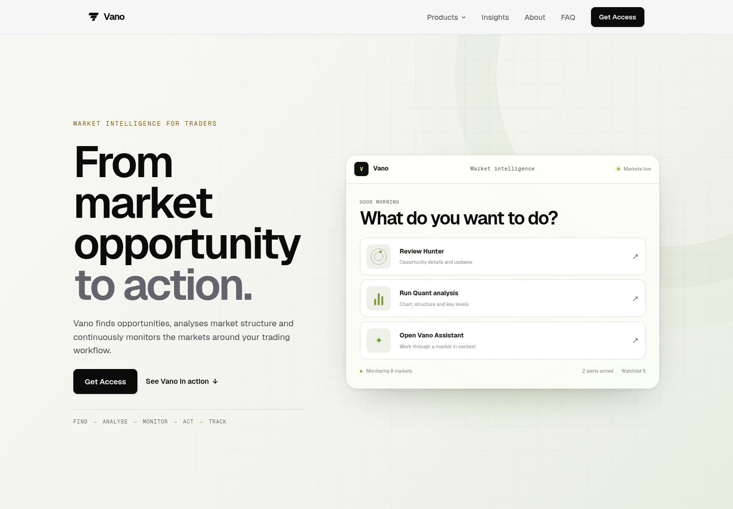
These images compare layout and messaging, not conversion performance. Explore the concept for Hunter, Quant, Assistant and the proposed FAQ.
Make the first screen earn its space.
What we observed
At the reviewed desktop size, a large gap sits between the navbar and the first meaningful content. Tall headings and product panels also separate the explanation from the experience further down the page.
The proposed move
Bring the headline and product proof higher. Pair each feature’s explanation with its demo in one coherent desktop view. On smaller screens, let content flow naturally instead of forcing a fixed-height viewport.
A visitor should understand the promise and see the next action without searching below the fold.
Give each product a proper front door.
What we observed
The hero’s three product shortcuts point to #hunter-motion, #quant-motion and #assistant-motion. Hunter and Quant already have dedicated links in the footer. The hero panel also uses a letter V while the main navbar uses the brand mark, and displays a fixed ‘Good morning’ greeting.
The proposed move
Link the hero to descriptive product pages with useful explanations, examples and next actions. Reuse the existing Hunter and Quant routes; add an Assistant page if needed. Use the same brand mark and a neutral greeting such as ‘Explore your next move.’
Clear destinations improve orientation. Substantive, crawlable product pages can help search engines and answer systems understand each offering. Hash links are useful for in-page navigation; changing a URL alone is not an SEO or AEO strategy.
Show Hunter doing the actual work.
What we observed
Hunter is represented by a styled, animated example. It explains the concept, but it is not a recording of the actual product being used.
The proposed move
Record a short desktop walkthrough: open an opportunity, inspect its timeframe and invalidation, then review the next action. Embed a captioned YouTube recording with a lightweight poster and click-to-load playback. Keep the title, explanation and video together.
Users and prospective investors can inspect what has shipped. A product recording demonstrates the workflow; it does not establish trading performance.
Let understanding begin with one request.
What we observed
Quant has an illustrative analysis sequence and timeframe controls. That is different from letting a visitor submit a market request and receive a real response before moving to Telegram.
The proposed move
Offer one clearly scoped ungated analysis with a visible allowance, selected market and timeframe, data timestamp and an honest limit state. For this concept, visitors can explore a labelled sample. A production trial would need server-side rate limits and real data.
The visitor can assess the shape of the output before signing up. Measure whether completed trials lead to qualified activation, rather than assuming conversion will rise.
Give the assistant a question worth asking.
What we observed
The Assistant illustration includes preset questions and an example answer. It communicates context, but does not show an open visitor conversation with the live product.
The proposed move
Carry the selected sample analysis into a short guided conversation. Let people ask what changes the view or why a level matters. Show what is attached, what the assistant can do, and where the free session ends.
A connected, bounded interaction makes the relationship between Quant and Assistant easier to evaluate. The proposed preview uses authored sample responses, not a live AI model.
Answer the last questions before the last CTA.
What we observed
The landing page links to a separate FAQ page but does not include an FAQ section before its closing call to action.
The proposed move
Place a concise FAQ before the final CTA. Explain access, supported markets, trial limits, data freshness and who remains responsible for decisions. Keep answers consistent with the product’s verified pricing and capabilities.
Visitors can resolve basic uncertainty without leaving the decision point. Avoid inventing pricing, usage allowances or performance claims.
07 / VALIDATION
A direction is a hypothesis. Test it.
We have not seen Vano’s analytics, conversion rates, paid product internals or customer research. These recommendations come from the public page and should be tested with actual visitors.
| Question | What to observe |
|---|---|
| Do visitors understand Vano faster? | Ask new visitors to explain the product after seeing the first screen. |
| Does a recording provide useful proof? | Recording starts, meaningful watch completion and subsequent product-page visits. |
| Does the sample help people take a next step? | Sample starts, completions and clicks through to access. Compare against a baseline. |
| Does the page work on small screens? | Task completion on mobile, keyboard access, readable charts and no clipped controls. |
Do not claim a conversion lift until it is measured. If Vano later adopts a recommendation, document the actual change and results separately from this concept.
SOURCES & SCOPE
Reviewed on 3 October 2026: Vano’s public landing page, its visible product links, and supplied desktop screenshots. The live page includes animated and selectable examples. This is an experience review, not a trading-performance assessment, security audit or investment recommendation.
THE STRATEGIST
Mojeeb Titilayo
Product Engineer & Strategist. Founder of BlindspotLab. I turn product observations into practical strategy, design and working experiences.
Meet Mojeeb ↗LET’S FIND YOUR BLINDSPOT
Built something good?
Make its value obvious.
Bring us the product. We’ll help connect what it does with what people experience.
Request a product review ↗← All theses